I have been listening to the recent series on dairy farms on NPR's Morning Edition. Yesterday's was about groundwater pollution in New Mexico. From the article:
More and more milk comes from confined animal feeding operations (CAFOs), where large herds live in feedlots, awaiting their thrice-daily trip to the milking barn. A factory farm with 2,000 cows produces as much sewage as a small city, yet there's no treatment plant.
Here is a link.
Today the piece was about an Ohio farmer, Warren Taylor, who raises his cows outdoors on grass (the CAFO cows are fed a mix of corn and soybeans). He also pasteurizes at a lower temperature and does not homogenize the milk: the cream rises to the top, and you have to shake it before pouring. The milk is sold 48 hours out of the cow and he won't deliver more than an eight hour drive. He claims that all this makes the milk taste better. He can only produce about half the milk per cow that the CAFO operations produce, so his milk costs about twice as much.
Read it here.
Both pieces have good examples of dairy industry propaganda. In the New Mexico piece, the industry sponsors a billboard with an image of a family in front of a green field with cows grazing in an effort to dampen public support for tougher regulations of the CAFO farms. Of course, the image is nothing like the actual farms.
In today's story, the industry spokesman disputes that Warren Taylor's milk tastes any better than industry standard milk. He speculates that it is a "placebo effect." People just think it tastes better because they are paying more for it.
The piece ends with customers at the local Whole Foods tasting Mr. Taylor's milk and just going bananas about how good it is. It would have been better had he asked them to compare it to the standard milk.
I used to buy milk from a local farm when I lived in Chapel Hill, North Carolina. It was definitely better than the industry standard, and not that much more expensive. I miss it, especially their egg nog, which they sold this time of year.
Thursday, December 10, 2009

Microliving
Here is a neat article about a couple who bought a 175 square foot apartment in Manhatten for 150K. They lived in NJ for a while and decided they wanted to live in the city. With such a small space, they just have room for a bed and a cappuccino machine. They don't even have a trash can - but with no possessions, they generate very little trash (and what trash there is they walk across the hall to the chute). They keep their clothes stashed at various dry-cleaners around town, wear jogging suits at home, and change on their way to work. So their lives are totally in the urban fabric of experience. They don't nest. Maybe not for everyone, but it can be done.
Tuesday, December 1, 2009
The grad studio 3 class finished their models and presented them yesterday. We all worked very hard and we are pleased with the results.
 Adding roads and painting terrain
 Cutting house shapes out of foam, painting them black and wrapping them in card stock.
 Here we have some foam townhomes, painted and waiting to be wrapped.
 Adding trees made from wax myrtle twigs.
 A view across the wetland at the pavilion, styled after a Greek temple, beyond which is the common green and the cohousing community's common house.
 Another view of the pavilion.
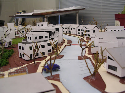
 Austin's model
 Casey's model.
 Presentation in the gallery.
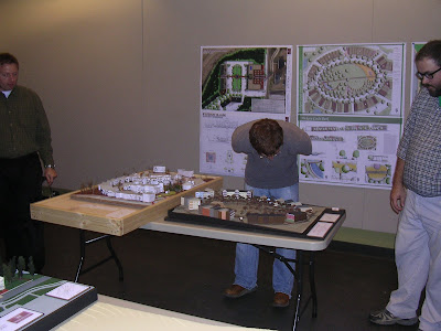
 From left: Paula Abdul, Randy Jackson and Simon Cowell.
 Adding roads and painting terrain
 Cutting house shapes out of foam, painting them black and wrapping them in card stock.
 Here we have some foam townhomes, painted and waiting to be wrapped.
 Adding trees made from wax myrtle twigs.
 A view across the wetland at the pavilion, styled after a Greek temple, beyond which is the common green and the cohousing community's common house.
 Another view of the pavilion.
 Austin's model
 Casey's model.
 Presentation in the gallery.
 From left: Paula Abdul, Randy Jackson and Simon Cowell.
Thursday, November 19, 2009
Bjork finds a model of a city inside her TV
All the work we have been doing on models in Studio 3 (and watching the undergrads put together their models earlier this semester) has reminded me of one of my all-time favorite videos on YouTube, where Bjork explains how TV works. This makes me want to put some circuit boards in my model. You can enjoy it here.
Studio Project 3

The Studio 3 gang is busy creating site plans and three dimensional models of portions of our neighborhood infill sites. Here is my terrain after a couple of days of cutting topo lines from chip board. We are all working at twenty scale: one inche equals twenty feet. I decided to build a wooden frame for my model, to keep it from warping but also to provide a square edge that I could lay my layers of board into and use as a jig to keep everything in line.

Here Austin is finishing up the pen work on some really sharp looking section drawings. He is getting all his 2D stuff done before starting the 3D model.

Meanwhile over on Casey's side of the room an oval-shaped neighborhood park is beginning to emerge out of chipboard and blades. It's truly magical!
Sunday, November 8, 2009
Studio 3 Project 2

I have neglected my blog for nearly a month and I feel pretty bad about it. Here is the main reason: our graduate studio class was working on this infill development project. A good bit of time was devoted to the SketchUp model, and I am including the fly-through movie here. I pulled the two-foot contours up pancake style, and drew my roads and sidewalks right onto the pancake terrain. This was a little time consuming. Some of the buildings I drew into the model, others were pulled up out of a flat version of the master plan and moved.
The site is a 31-acre area between town and campus. A historically significant cotton mill is on the site, that's the big red building with the rows of large windows in the model. There are some other buildings, but I chose not to keep them. Part of the site is in the FEMA 100-year flood zone. That's where I put the constructed wetland.
The concept was "home". The design is meant to foster aging in place. A specialty grocery store, recreational opportunities, retail and mixed use buildings should provide residents with all their daily needs right there in the neighborhood. The idea of "neighborhood completeness" which Douglas Farr introduces as a modified version of LEED-ND certification requirements in his book Sustainable Urbanism drives this design.
Right off I will admit that the entrance from Spring Street has a problem in that the two towers frame a view of the corner of the assisted living center. In the model I ran out of time and didn't finish all the roads. Also you can see on the master plan that there are a lot more trees on the plan than are visible in the model. I think there are some good things in this plan, and there are a lot of things that need work. Go ahead and start tearing it up; I can take it.
Sunday, October 11, 2009
Don't Top The Crapemyrtles

My blog needs a picture and I would like to get on my soapbox for a moment and state my position on the great crapemurder debate of the last few decades. This is a photo of some crapemyrtles at my Studio 3 design project site, the E.E. Cooley Cotton Mill grounds and environs. This is what happens when you leave crapemyrtles alone. Would you not rather look at this all winter than the stubs that remain where people have topped crapemyrtles all over town, all over the south? I had a neighbor in Chapel Hill who had some nice 30 foot crapemyrtles that she, one afternoon in February, cut back by fifteen feet or so. I asked her (politely) why she did this and she could only come up with the reason that this is what you are supposed to do, you need to cut them back before the ACC tournament.
I have pruned hundreds of these in my career as a landscaper. All this tree needs is about a half hours worth of thinning. Remove branches that are dead, dying or crossing, and remove some of the inward growing branches to improve air circulation (reducing risk of sooty mold). That's it. Topping the trees causes buds to break from below the bark, resulting in vigorous, suckering type growth which is too weak to support the blooms. These weak branches then bend over or snap, which doesn't matter really because they are just going to be cut off at the end of the season anyway. A good example in Starkville are the ones along the entrance to McDonald's behind Strange Brew. It seems to me that those who prune crapemyrtles this way view the tree as strictly a producer of color. The thinning technique that I describe results in a tree that looks good year round. Or, as the photo proves, you can do nothing at all to the tree and it still looks pretty darned good. The visual interest comes from a pattern created by gradients: multiple thick trunks at bottom give way to multiples of multiple thin twigs at the top, a steady visual rhythm of coarse to thin texture. Put a bird feeder in it and you have a middle ground, a stage for dynamic movement through which one can view the background in the distance. If you lop off the crown in the misguided assumption that it will produce more bloom next summer you loose all that dynamic potential.
This is at a smaller scale than is generally discussed in Studio 3, but I saw the tree on my site and wanted to share these thoughts with everybody.
Subscribe to:
Posts (Atom)